AS.
Home / Work / Australia Study
Project 05

Australia
Study

Logo, brand identity, and web presence for an Australian education platform, built to feel warm, supportive, and credible for international students.

Role
Logo | Brand Identity | Web
Tools
Illustrator | Figma | Webflow
Year
2024
Type
Client Project
The Problem

An education platform without a distinctive identity

Australia Study needed a brand identity that could work across website, student guides, printed materials, outdoor advertising, and digital campaigns. It had to feel credible and professional to educators while still feeling approachable and aspirational for prospective students.

The challenge was finding the middle ground between overly corporate education branding and something too playful to feel trustworthy. The final direction focused on warmth, clarity, and a stronger sense of place.

Design Thinking

Symbol as strategy

Cultural Grounding
The logo concept drew from the Australian map outline and the boomerang to communicate movement, place, and direction in a subtle way.
Journey-Led Meaning
A soft dot inside the mark acts as an origin point, reinforcing the idea that Australia Study helps students begin and navigate their journey.
Warmth over Institution
Orange, eucalyptus green, and soft neutrals helped the brand feel optimistic and approachable while still maintaining structure and professionalism.
Process

From sketch to system

01
Concept Development
Explored multiple directions across geography, movement, and education before refining the strongest symbol-led approach.
02
Logomark Refinement
Shaped the final AS symbol to feel fluid, memorable, and legible across both digital and physical applications.
03
System Expansion
Extended the identity into a broader color, layout, and application system that could scale across campaigns and collateral.
04
Website Direction
Translated the identity into a student-friendly website direction focused on clarity, approachability, and trust.
05
Brand Rollout
Applied the system across printed guides, collateral, and outdoor formats to test consistency across touchpoints.
Wireframe Exploration

Wireframe Exploration

Early wireframes were used to establish the website’s layout, content hierarchy, and key communication areas before applying the final brand system. This helped organise information clearly for prospective students while ensuring the digital experience felt supportive, modern, and easy to understand.

The wireframe stage focused on balancing trust, clarity, and visual rhythm so the final interface could communicate both professionalism and approachability.

Digital

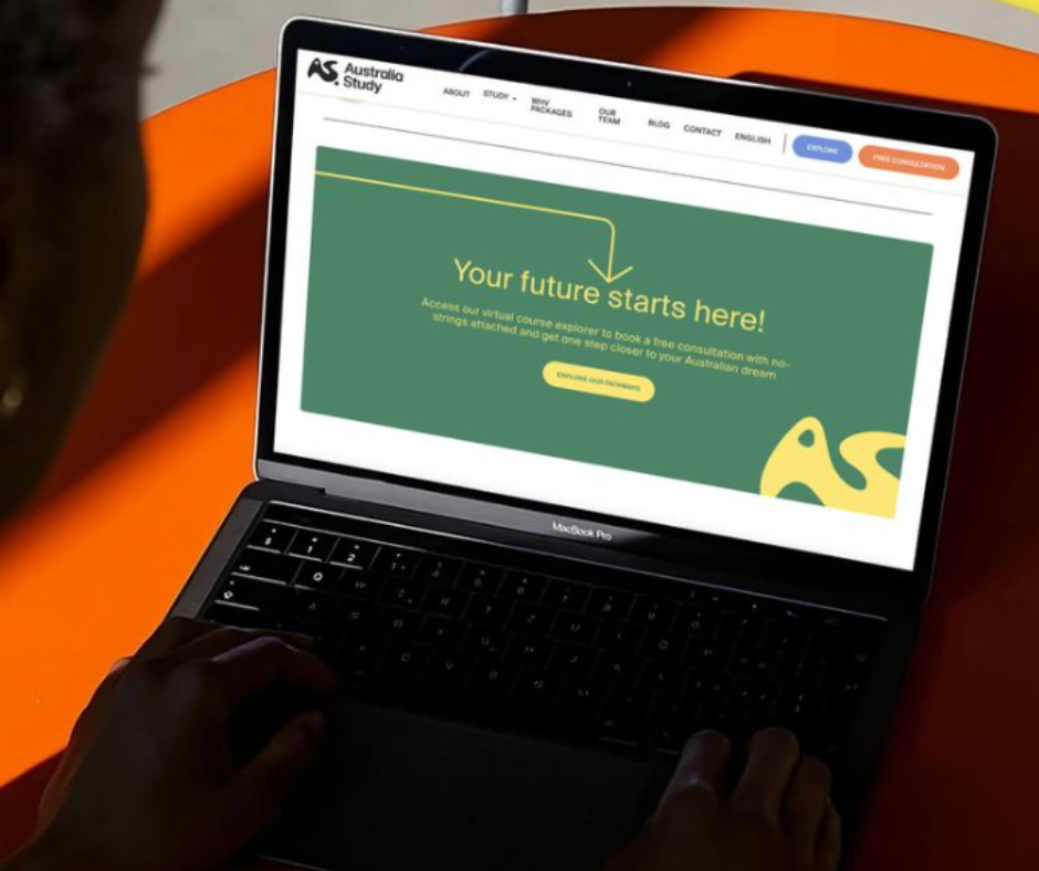
Website / Digital Presence

Australia Study needed a digital presence that felt clear, trustworthy, and easy to engage with for prospective international students. I translated the new identity into a website direction that balanced friendliness with credibility, using strong colour blocking, simple navigation, and clear calls to action to make the platform feel more accessible from the first interaction. This helped position the brand as supportive and modern, rather than overly corporate or institutional.

The interface used the brand palette in a way that felt optimistic and geographically grounded, with warm tones and organic shapes carrying the identity into the digital experience. The result was a web presence that made the service feel more approachable while still communicating professionalism and structure.

View live website ↗
Australia Study website displayed on a laptop screen
Identity

Logo Identity

The Australia Study identity was built around a custom “AS” symbol designed to feel fluid, memorable, and culturally grounded. The form draws inspiration from the Australian map outline and the boomerang, using shape as a way to communicate movement, direction, and the idea of a student journey. A soft dot element within the mark acts as a subtle origin point, reinforcing the message that this is where the journey begins.

Rather than relying on a generic education aesthetic, the logo was designed to feel warm and distinctive. This gave the brand a recognisable core mark that could scale across web, print, and campaign applications while still feeling modern and approachable.
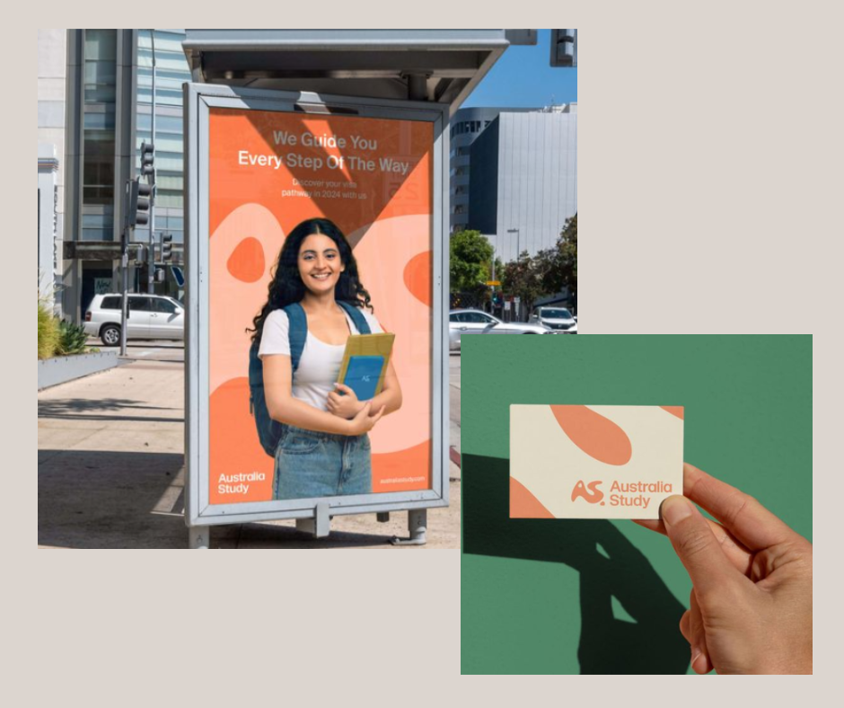
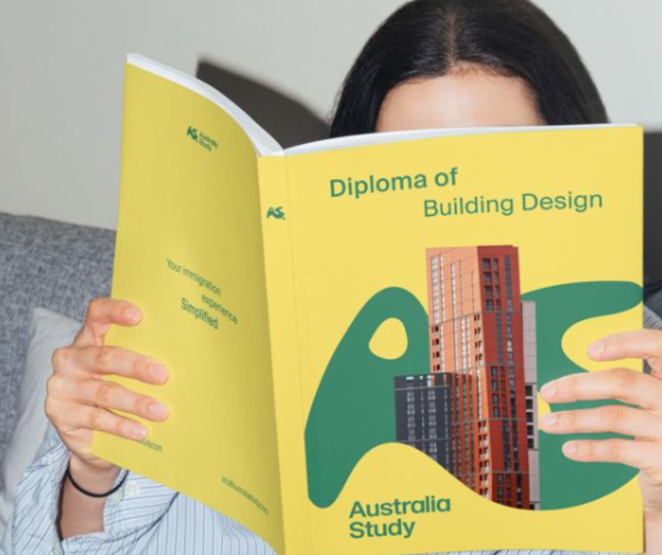
Australia Study logo identity shown as a standalone AS symbol
Applications

Brand Applications

The identity system was designed to extend well beyond the logo itself, with applications across printed guides, business collateral, and outdoor advertising. These mockups show how the Australia Study brand holds together across different formats while keeping a consistent visual language. The warm orange, eucalyptus green, and soft neutral tones help the brand stand out while still feeling supportive, aspirational, and easy to trust.

By applying the system across both promotional and informational materials, the project demonstrates how a single visual identity can create consistency at every touchpoint. This made the brand feel more established, more scalable, and better equipped to communicate with students across both digital and physical spaces.

Australia Study brand applied to outdoor advertising and business collateral
Australia Study printed guide cover showing the brand system in use
Outcome

Clean, versatile, culturally resonant

12+
Brand touchpoints
The identity system was designed to hold together across digital, print, and campaign formats.
3
Core showcases
Website, logo identity, and brand applications each demonstrate the system working at a different scale.
Visual clarity
A warmer, more grounded system helped the brand feel more approachable while retaining structure and professionalism.
Next Project
Sei Mai Name